PureWow
Desktop Navigation Redesign
Challenge
The existing desktop navigation was overwhelming and difficult to use, creating user friction and failing to strategically drive traffic to key content areas.
Lacked a clear visual hierarchy; cluttered design.
Categories were not grouped intuitively.
Did not effectively guide users toward high-priority content verticals.
Failed to reflect user data from site analytics.
No intentional space for promoting trending or recirculated content.
Solution
Redesign the desktop navigation to transform navigation from a functional necessity into a strategic, brand-forward content driver.
Establish a clear hierarchy and visual structure.
Improve usability through better grouping and spacing.
Align navigation structure with observed user behavior.
Drive traffic to priority content verticals.
Reflect the PureWow brand visually and editorially.
Create space for trending and recirculated content within dropdowns.
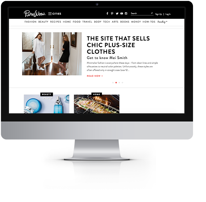
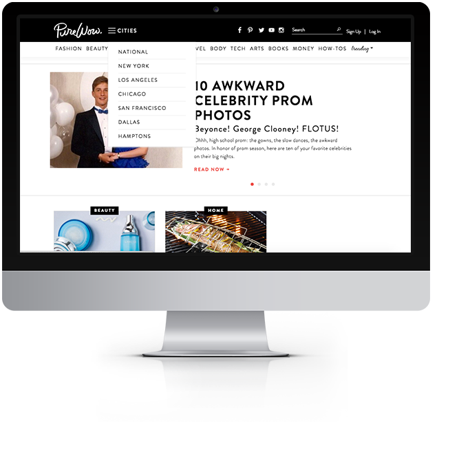
Original Navigation
Original navigation was not intuitive, felt dated, and did not emphasize the most popular content or content that PureWow wanted to advertise.
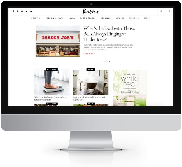
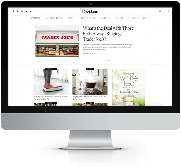
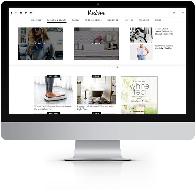
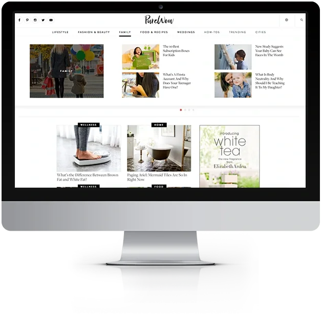
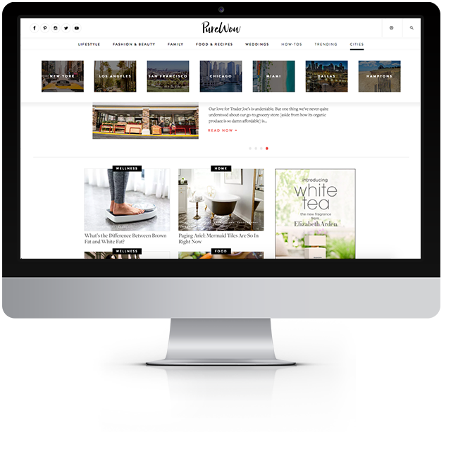
New Navigation
The result was a streamlined, visually engaging navigation system that improved usability, strengthened brand identity, and strategically drove traffic to key content verticals.
Clear Visual Hierarchy
Increased white space to reduce visual clutter.
Refined typography to create distinction between primary and secondary items.
Logical grouping of categories based on related content themes.
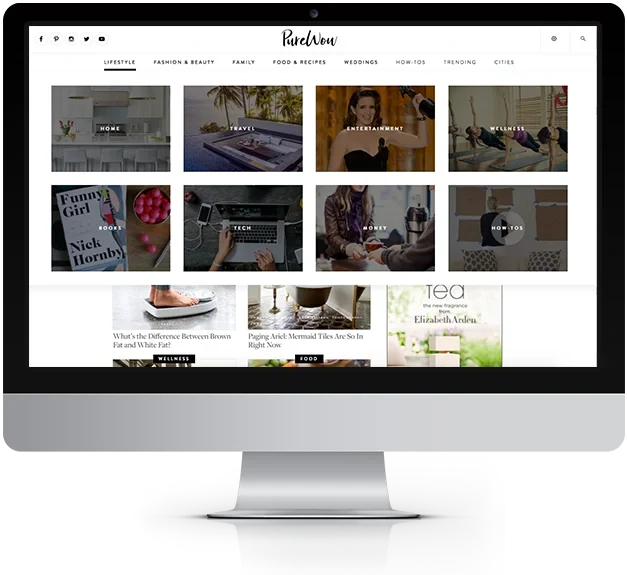
Brand-Forward Imagery
Large, visually compelling images were incorporated into dropdown menus.
Each navigation item featured imagery that reflected the PureWow brand and corresponding content category.
Imagery helped users quickly associate categories with lifestyle themes.
Data-Informed Category Structure
Navigation organization was informed by user behavior data and engagement trends.
Priority verticals were given greater prominence in layout and visual weight.
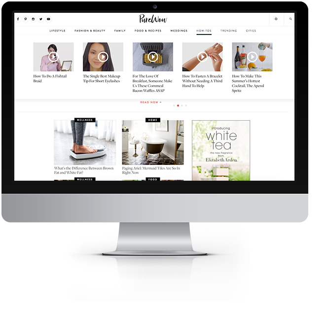
Content Recirculation & Trending Space
Dedicated areas within dropdown menus were designed to feature trending or high-performing content.
This supported content discovery and encouraged deeper site exploration.