PureWow
Logo Redesign
Our team was initially tasked with developing a logomark from the existing identity, but it quickly became clear that the core logo itself required modernization. We saw an opportunity to elevate the brand with a more contemporary, expressive identity that better reflected the sophistication and personality of our audience.
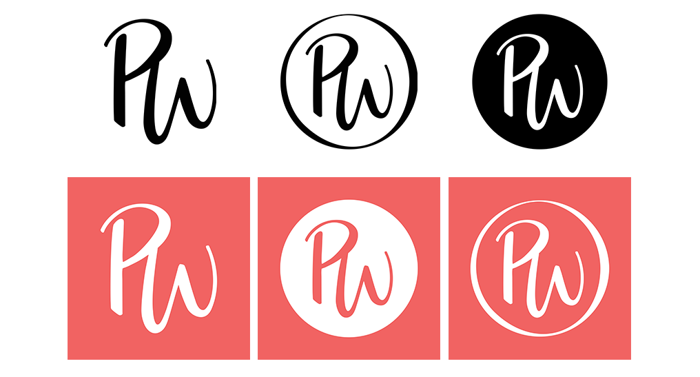
Over six months, we led a full redesign of the logo and developed a flexible system of three complementary marks, enabling consistent and adaptable use across a wide range of channels and future applications.

Challenge
Redesign the original PureWow logo: to reflect our current branding, to be optimized across all content channels and devices with the addition of a logomark, and to continue to evolve and scale with our brand over the next 5-10 years.
Process
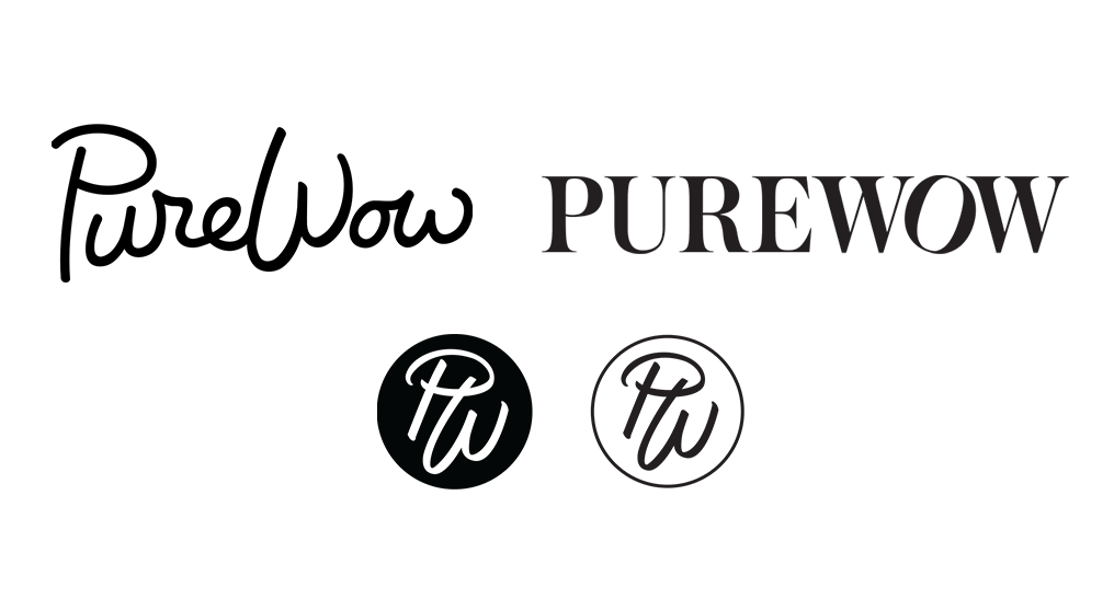
A few process iterations of the logo and logo marks. The "P" and "W" from the old logo did not translate well into a "PW" logo mark, which proved the need for an entirely new design. We experimented with keeping the script as a base and redefining the stroke vs. a completely different approach with a serif.
Final Result
A redesigned logo and new logomarks to be used across a wide range of channels, including social channels, and future applications.